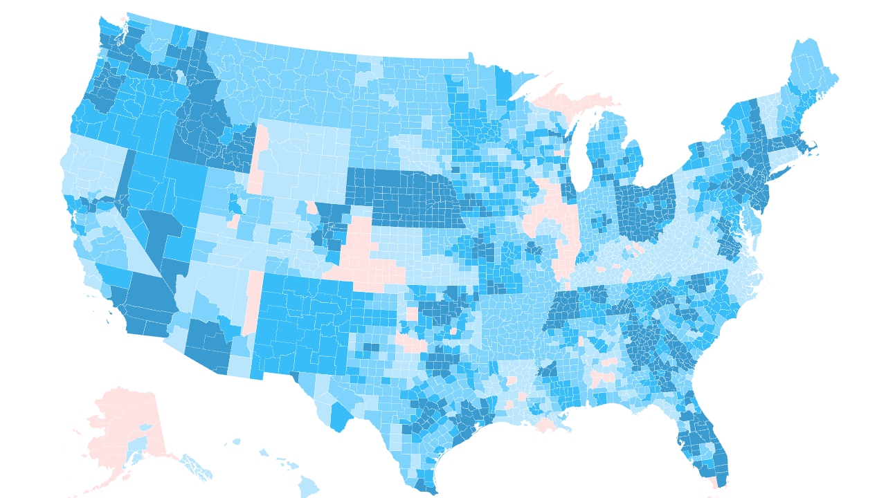
A fully validated, county-level analysis of the 2026 individual health insurance marketplace, mapping the competing carrier options across all 3,143 counties in the United States.
Insurer participation is a key driver of competition, plan options, and premium pricing in the Affordable Care Act (ACA) individual marketplaces. Heading into the 2026 plan year, we compiled a complete county-level dataset mapping Qualified Health Plan (QHP) options across all 50 states and the District of Columbia.
Across all 3,143 counties, insurer competition varies widely. Counting by parent company — so affiliated brands like Blue Cross Blue Shield of Michigan and its Blue Care Network HMO count as one carrier — 701 counties enjoy robust choice with five or more competing insurers, while 164 counties remain monopoly markets with a single carrier, leaving those enrollees exposed to premium swings with no alternative. The most competitive counties field as many as 10 distinct carrier groups.
Nationwide 2026 Insurer Participation Map
Hover over any county on the map below to see the count and names of the active carriers offering individual medical plans.
2026 ACA Insurer County Participation Baseline
Source: CMS QHP Landscape (FFE) + SBM SERFF service-area filings, Georgia Access PUFs, and official state issuer-by-county maps, 2026. Fully validated.