
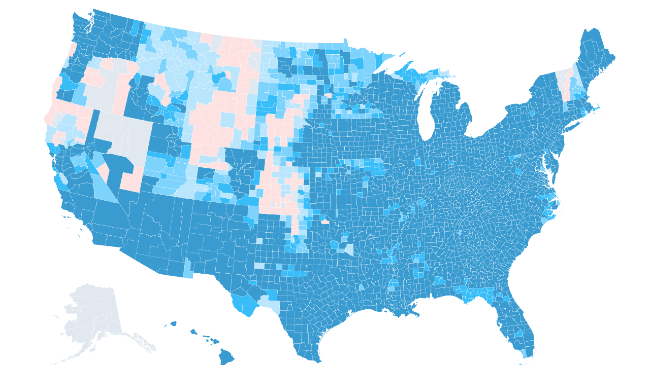
Medicare Advantage now covers more than half of everyone on Medicare, and the plan you can buy depends entirely on where you live. Two counties a state line apart can offer wildly different choices. So heading into the 2026 plan year I built the same thing for Medicare that I built for the ACA marketplace: a complete, county-level map of which carriers actually compete for your enrollment.
I started from the CMS 2026 Medicare Advantage and Part D Landscape file, the authoritative list of every approved contract and plan. I dropped the standalone Part D drug plans, since those are drug-only and sold by region rather than a real medical-plan footprint, and I counted the remaining Medicare Advantage plans (including HMOs, PPOs, cost plans, and Special Needs Plans) by their parent organization. That way UnitedHealthcare and its AARP-branded plans count as one carrier, not two.
Source: CMS CY2026 MA & Part D Landscape (March 2026 release)
The nationwide carrier map
The map below shades every county by how many distinct carrier groups sell a Medicare Advantage plan there. Hover any county to see the count and the names. Use the Plan type filter to switch between all plans, general open-enrollment plans, and the three kinds of Special Needs Plan, and watch the footprint change.
The typical county has 7 competing carrier groups, and the market is deep almost everywhere: 2,435 counties have five or more carriers, and 556 have ten or more. That is a very different picture from the ACA individual market, where five-plus-carrier counties are the exception. Medicare Advantage is the most competitive line of insurance in the country by this measure, because the federal payment follows the beneficiary and carriers chase it.
But the averages hide the gaps. 113 counties still have just a single Medicare Advantage carrier, and they are almost all rural. In those places the "choice" between traditional Medicare and Medicare Advantage is really a choice between one private plan or none, and that lone carrier sets the benefit design with nobody pushing back.
Who has the biggest footprint
Four national carriers blanket the country. UnitedHealth Group reaches 2,787 of the 3,081 counties, and Humana is right behind at 2,657. Aetna (CVS Health) and Wellcare (Centene) round out the group that competes coast to coast.
| Parent organization | Best-known Medicare brand | Counties | States |
|---|---|---|---|
| UnitedHealth Group, Inc. | UnitedHealthcare / AARP | 2,787 | 49 |
| Humana Inc. | Humana | 2,657 | 47 |
| CVS Health Corporation | Aetna | 2,139 | 43 |
| Centene Corporation | Wellcare | 1,853 | 32 |
| Elevance Health, Inc. | Anthem | 1,516 | 24 |
| Devoted Health, Inc. | Devoted Health | 999 | 29 |
| Health Care Service Corporation | Blue Cross and Blue Shield | 948 | 31 |
| Molina Healthcare, Inc. | Molina | 859 | 20 |
| Mitchell Family Office | Regional MA plans | 552 | 13 |
| Medica Holding Company | Medica | 327 | 6 |
The interesting name on that list is Devoted Health, an insurtech that did not exist a decade ago and now sells in 999 counties across 29 states. Medicare Advantage is where new carriers can still scale fast, because the payment model rewards anyone who can manage risk and market to seniors, and Devoted has done both.
Why the SNP filter matters
Not every plan is open to everyone. A big share of Medicare Advantage growth is in Special Needs Plans, which only accept specific populations, and the map lets you isolate each kind:
- D-SNP (Dual-Eligible) plans, for people on both Medicare and Medicaid, are the most widespread. They reach 2,949 counties, nearly the entire map, and they are where the fastest enrollment growth and the sharpest policy fights are happening.
- C-SNP (Chronic Condition) plans, for people with conditions like diabetes or heart failure, appear in 2,338 counties.
- I-SNP (Institutional) plans, built for people in nursing facilities, cover 2,080 counties.
Flip the filter to General enrollment and you see what a typical shopper without those qualifications actually gets. In some markets the count barely moves, because the same carriers sell both. In others, especially dense urban counties, a chunk of the apparent competition is D-SNP plans that most people cannot join. That distinction is invisible in a headline "number of plans" statistic, and it is exactly the kind of thing this map is built to expose.
What this is and is not
This is a carrier footprint, not a plan count. A county with seven carriers might have fifty individual plans on the shelf, because each carrier sells several. Counting carrier groups is the honest way to measure real competition, since ten plans from one company is not the same as ten companies. It is the same method behind my 2026 ACA baseline, so the two are directly comparable.
Every number here traces back to the CMS Landscape file and is reproducible from the build script in the repo. As carriers file changes for 2027, I will re-run it and track who is expanding and who is pulling back, the same way I am tracking the ACA exits.